- HOME
- NEILSEN'S HEURESTICS

- 1. Visibility of system status
- 2. Match between system & the real world
- 3. User control & freedom
- 4. Consistency & standards
- 5. Error prevention
- 6. Recognition rather than recall
- 7. Flexibility & efficiency of use
- 8. Aesthetic & minimalist design
- 9. Help users recognize, diagnose, & recover from errors
- 10. Help & Documentation
- CONTRIBUTORS »
Together, Kristine and Rodya conducted a usability evaluation on the University of Illinois website using Jakob Nielsen's ten heuristics as their framework. In doing so, their goal was to conduct a thorough analysis capturing both the positive and negative design aspects. Overall usability was a top priority, with a special emphasis on the user. Their analysis considered how much importance the web designers at Illinois put into designing an efficient and effective website for all types of users. After all, users are at the heart and soul of the design process and should never be overlooked.
What follows is their analysis. Enjoy :)!
original website: http://illinois.edu/
hueristics: http://www.nngroup.com/articles/ten-usability-heuristics/
1. Visibility of system status
"The system should always keep users informed about what is going on, through appropriate feedback within reasonable time."
– Jakob Nielsen
It's important to never leave your users in the dark and to be upfront with them at all times. You never want users feeling lost as if they were in a foreign land. You want your website to be as accommodating as a five star hotel with a clearly marked path every step of the way. So remember, whenever you're lost, just look for the friendly Illinois logo.
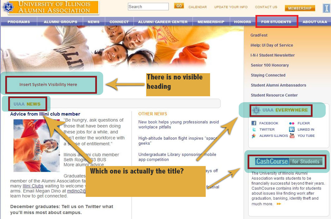
Ambiguity on the For Students Page
Although, we are located on the "For Students" page, it is unclear for the user to identify what page they are on. Due to the multiple misleading titles (highlighted in blue), there is ambiguity as to what page you're actually on. A user might assume that they are on the "UIAA News" page since the text stands out, so a better solution would be to have the title of the page appear in the box entitled "Insert System Visibility Here."
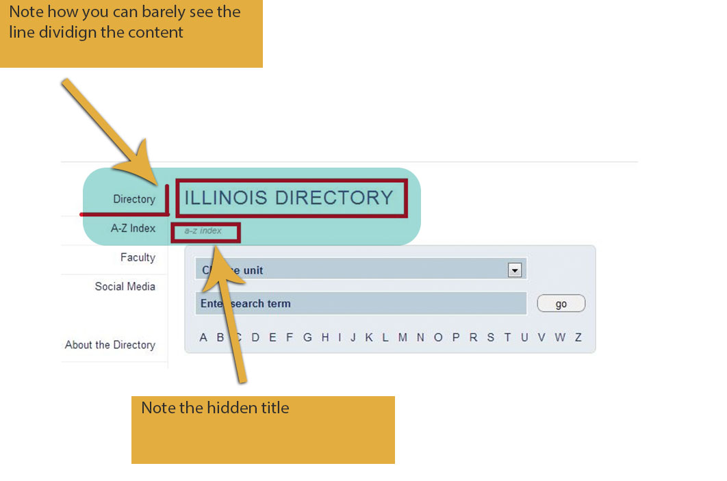
THE A-Z MYSTERY
Although it may be obvious that one is at the A-Z index, the page is titled "Illinois DIrectory" which bears the exact same header title as the Directory page. It would feel more appropriate if the header title read, "Illinois A-Z Index" as opposed to having it listed as subscript in grey text. This way, it would be obvious that one was at the A-Z index directory. Another minor problem is the difficulty in seeing the dividing border on the navigation bar to the left. I have marked the border with a bolded red line to show how difficult it is to see the border separating the content.
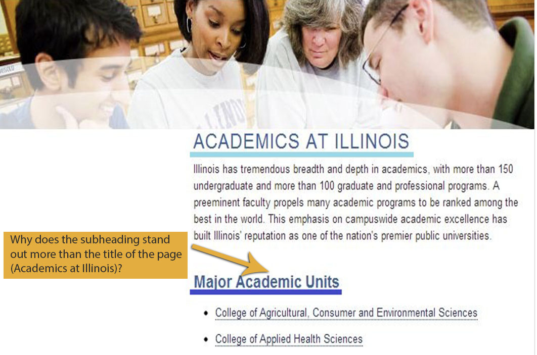
THE OVERSHADOWED ACADEMICS PAGE
Here we find ourselves on the "Academics" page, but the main title of the page is overshadowed by the bolded subtext, which is also a darker shade of blue. Although not a major issue, I would think that the title of the page would want to emphasized.
2. Match between system & the real world
"The system should speak the users' language, with words, phrases and concepts familiar to the user, rather than system-oriented terms. Follow real-world conventions, making information appear in a natural and logical order."
– Jakob Nielsen
It's important to stay away from terms that most users will not understand. A website should be designed in such a way that makes it easy for any user to be able to relate to it. The logic of the site should adhere to the rules and norms present in the outside world. Again, you don't want to scare away users with fancy words or an overly complex website.
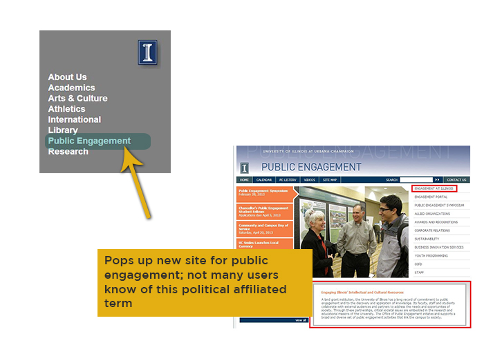
SO WHAT EXACTLY IS PUBLIC ENGAGEMENT?
Public Engagement - Is a political term that is not really understood by normal users and is more catered to a political audience. And upon clicking "Public Engagement", it still remains unclear as to what exactly the University of Illinois is trying to get at. The boxed area is the closest thing to a mission statement, but it doesn't become fully clear until one clicks the "Engagement at Illinois" page, which should be renamed to "About Engagement at Illinois." I feel that it takes too much time and effort to figure out what is meant by Public Engagement.
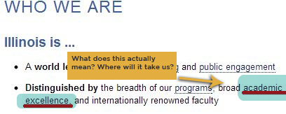
DID SOMEBODY SAY ACADEMIC EXCELLENCE?
Found under the "About Us" page, the term "academic excellence" is vague at best, but implies that the University of Illinois prides itself in being a distinguished university in terms of academics. Thus, one would think that by clicking on the hypertext, you would be taken to a page where such boasting is confirmed or backed up. Instead you are linked to their "Academics" page, as opposed to being linked to their "Rankings" page, which would make more sense.
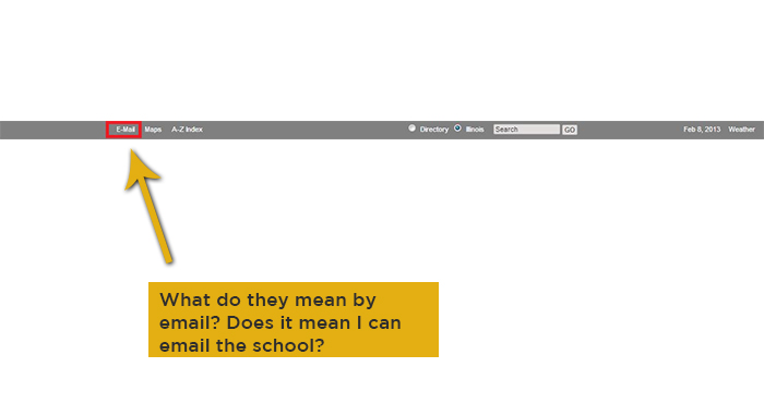
THE MYSTERY OF EMAIL
The e-mail link on the header is a vague term until one clicks on it. In no way does the "e-mail" link deal with the ability to email someone, but rather is a link that deals with the e-mail services offered by the University. A more appropriate name would be one that explicitly states the function of the link, like say, "Log-in to E-mail Services" or simply "E-mail Services."
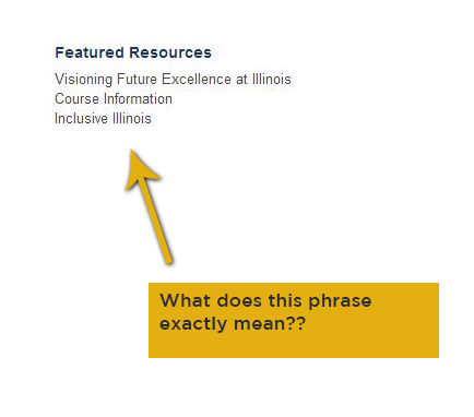
JUST HOW INCLUSIVE IS ILLINOIS REALY
What exactly is meant by Inclusive Illinois... it's a distinct and specific name that most people will not get, and probably skip over. It's very vague and is probably only understood by a small percentage of people, alienating all users who are not "in the know."
3. User control & freedom
"Users often choose system functions by mistake and will need a clearly marked "emergency exit" to leave the unwanted state without having to go through an extended dialogue. Support undo and redo."
– Jakob Nielsen
The user must always feel as if they are the captain of their ship. The user must always be in control of what happens on screen. Backseat driving should not be allowed. If you constantly are making decisions for your users, you will lose their trust, and they will not feel safe browsing your website. So remember to let your users feel as if they have ultimate control, make them feel as if they have a voice.
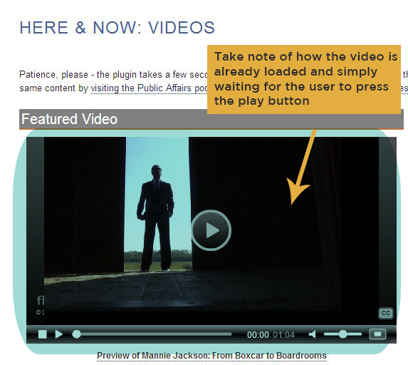
ILLINOIS TEACHES US TO BE PATIENT
Upon entering the videos page, the video loads but does not play allowing the user to remain in control. Also take note of the text, which lets the user know in advance that it takes a little bit of time for the videos to load.
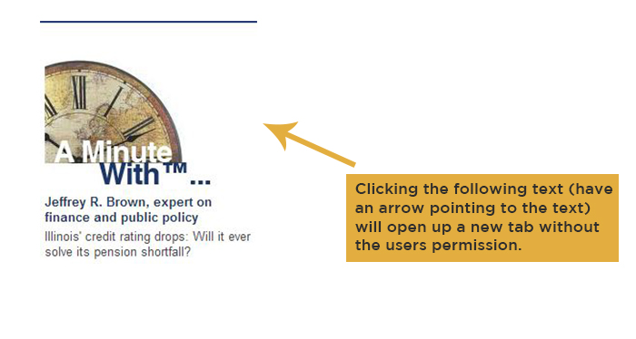
ILLINOIS TAKES OVER OUR BROWSER
On a different note, clicking some text opens up new tabs, which takes away some power and control from the user. One such example is found on the home page when clicking the text below "A Minute With."
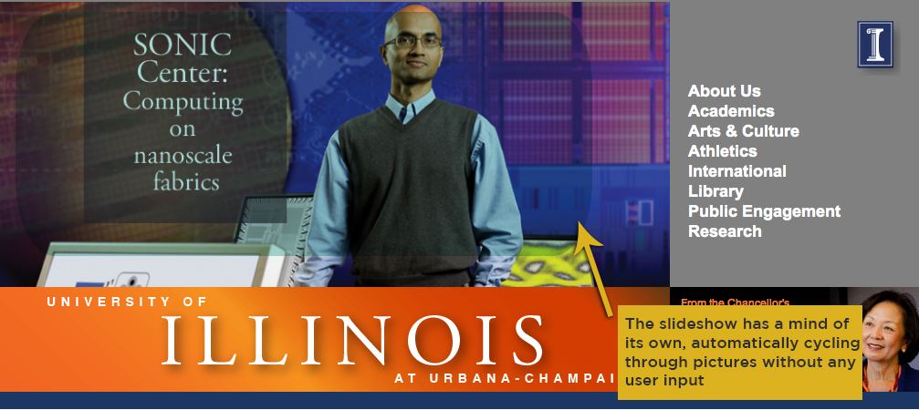
THE INCONSIDERATE GALLERY SLIDESHOW
On the home page, there is no way for the user to control the gallery of rotating pictures. So in the event that a user wants to view a specific picture, but missed their chance, they have to wait for the picture to come up again. This may frustrate some users, which is never a good thing.
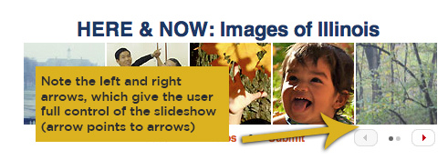
GOOD GUY GALLERY
In contrast to the previous lack of user control, this gallery of pictures offers the ideal amount of user control. Users are given the ability to scroll through the gallery of pictures by either clicking the left or right arrows.
4. Consistency & standards
"Users should not have to wonder whether different words, situations, or actions mean the same thing. Follow platform conventions."
– Jakob Nielsen
Users aren't too fond of change, and they dislike having to learn a new way of doing something they already knew how to do. Users are good at picking up inconsistencies in your site, whether it be layout or word usage, and you don't want to lose credibility with your users.
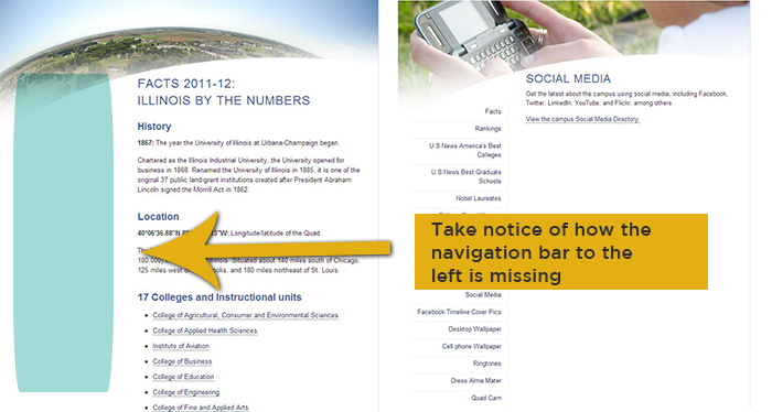
INCONSISTENT LAYOUT
Specifically the navigation bar located on the right side.
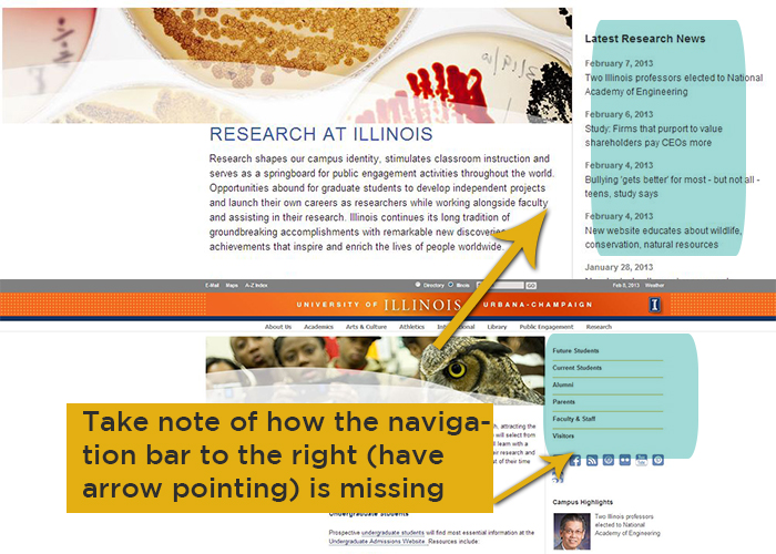
INCONSISTENT LAYOUT PART II
Inconsistent layout again - specifically the navigation bar on the left which appears on some pages, but not others.
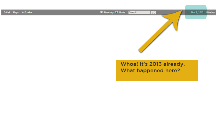
MEET THE SITE THAT TRAVELED BACK IN TIME
The above header is inconsistent because the date marked is wrong. This page is located under the maps section.
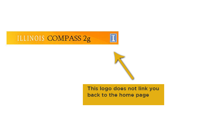
IM LOST AND WANT TO GO HOME
A majority of the time, the website does an excellent job at providing a way for the user to link back to the home page via the logo. However, this is one case in which the website fails, since the Indiana logo is not clickable. Thus, users may feel disappointment or even fooled for thinking that the logo would always serve as an anchor (or safe point) that would act as a safety valve in case users got lost within the website.

THE CASE OF THE MISSING ICONS
The header lacks icons on most every page, with the exception of one page.
5. Error prevention
"Even better than good error messages is a careful design which prevents a problem from occurring in the first place. Either eliminate error-prone conditions or check for them and present users with a confirmation option before they commit to the action."
– Jakob Nielsen
The best way to fix a problem is to stop it before it even happens. Keeping in mind that we all make mistakes, it becomes important to not punish users for any mistakes they may make. This requires some foresight because as a designer, you must anticipate errors that users are likely to commit and set up a safety net. In doing so, you will put your users at ease and gain their trust.
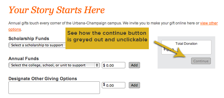
YOU SHALL NOT PASS
Note how the "continue" button is greyed out and unclickable, preventing the user from moving on to the next step. This is an added safety measure that won't allow users to continue if they haven't made a donation. In addition, any input that are not numbers is not allowed in the text field. If a user attempts to type a word, the letter is immediately erased.
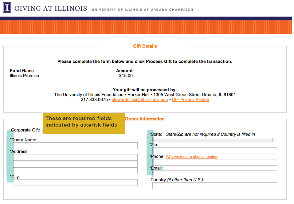
FIELD REQUIRED
The red asterisk symbol is generally understood to denote the required input fields when filling out a form. They function as a way of stopping users from skipping over necessary inputs of information. However, they fail to explicitly state this, which novice users may not know. Usually, websites mark the * symbol in the following manner: *Required field.
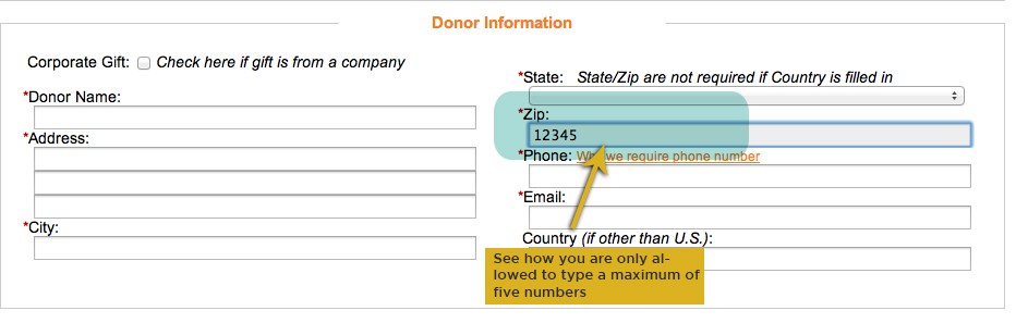
CAN I HAVE YO ZIP CODE
Another safety valve that the website makes use of is preventing users from inputting more than a five digit zip code.
6. Recognition rather than recall
"Minimize the user's memory load by making objects, actions, and options visible. The user should not have to remember information from one part of the dialogue to another. Instructions for use of the system should be visible or easily retrievable whenever appropriate."
– Jakob Nielsen
Visual information seemingly speeds by in the blink of an eye and individuals are prone to scanning to quickly access their desired information. By keeping this propensity in mind, usability design leans toward recognition rather than recall to lessen a user's memory load. With the usage of bread crumbs, ingenious color coding, and peculiar styles, a website is able to serve reminders for users rather than having them retrieve it from their vast memory. What you set your eyes on should be what you'll receive.
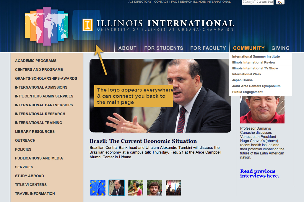
UBIQUITOUS LOGO + COLOR
As you navigate away from the main website to linked sites such as the "International" page, the University of Illinois logo remains on the page to enable users to navigate back to the main site. The logo illuminates as a strong brand identity and lets the viewer know that it is the trademark for the college. Although this is a great feature, it is not always obvious whether or not the logo is clickable. Color-wise, the blue and orange tints are major representations of the college's spirit and by shading every page with hints school colors, the UI website lets users easily recognize their colors.
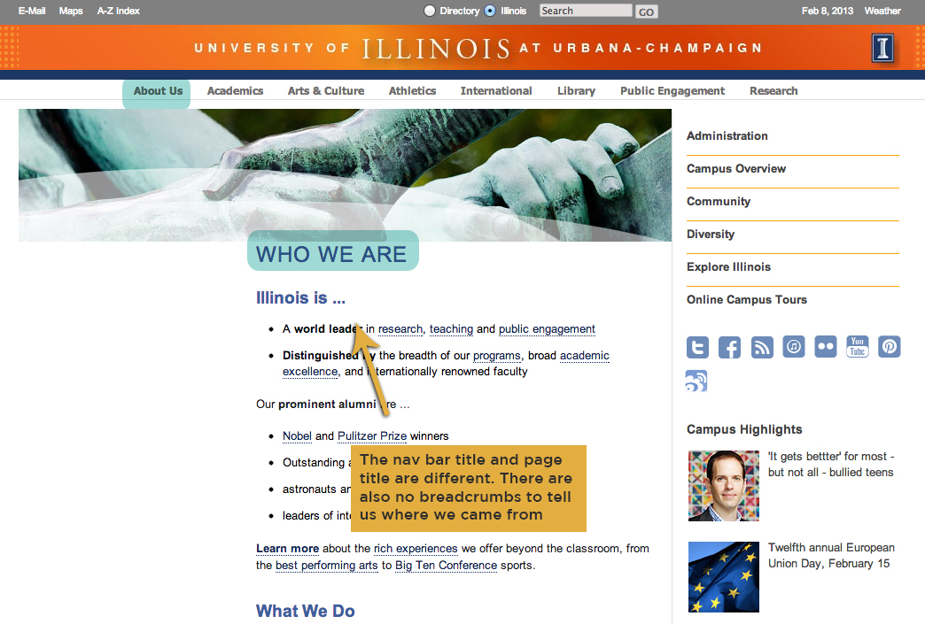
HEADERS + MISSING BREAD CRUMBS
The hierarchy of the website is complex as destinations have no historical path. The absences of breadcrumbs make it difficult to trace where you've navigated from. There are some pages in which you can only navigate to within another page; this creates a virtual labyrinth for users. This one-way street doesn't allow users to navigate back to previous pages easily--there are no u-turns on this road. The headers for some pages are inconsistent to the navigation bar title. For example, the "about us" page is titled "Who We Are." The site lacks appropriate elements to let users recognize items easily; recall is the main go-to method for the University of Illinois website as its website is a web of intricacy. The density and text-heavy components of the website decreases the ability of recognition as too many other things get in the way.
7. Flexibility & efficiency of use
"Accelerators -- unseen by the novice user -- may often speed up the interaction for the expert user such that the system can cater to both inexperienced and experienced users. Allow users to tailor frequent actions."
– Jakob Nielsen
Since there is a diversity of viewers, websites need to be adaptable to a wide range of audiences from everyday novices to savvy connoisseurs. No matter how equipped a person's skill set is, the website should be able to mold and efficiently let the users navigate.
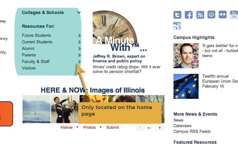
Where'd you go?
A great deal of visitors refer to the "resources for" section to find crucial information, but the extensive menu only exists on the homepage. This makes it extremely difficult for users to navigate to their desired destination as breadcrumbs or a new menu is not available for them to backtrack. For inexperienced users, this may cause extreme uncertainty as they don't know where to go on from thereon.
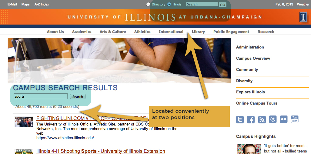
SEARCH BAR
Since the search bar is located at the top of the page, this makes it effortless for users to discover wanted information. Having the directory and Illinois option lets user choose the appropriate category for their search. Even though this is a great feature, a fixed search bar at the top might make searching more efficient rather than having to scroll all the way back to the top. Another positive aspect of the search bar is that it lets you complete another search without having to go back to the new page--in fact it has two places to search again.
8. Aesthetic & minimalist design
"Dialogues should not contain information which is irrelevant or rarely needed. Every extra unit of information in a dialogue competes with the relevant units of information and diminishes their relative visibility."
– Jakob Nielsen
Beauty is in the eye of the beholder, but websites will be overall attractive to different types of users with the execution of aesthetically pleasing and minimalist design. Organization is the key in this principle. Making sure essential information is apparent and avoiding clutter will definitely bring comfort to users' eyes. Conversely, "what goes together semantically goes together visually" and this informational gem will make sure websites arrange properly (Kirsh, lecture).
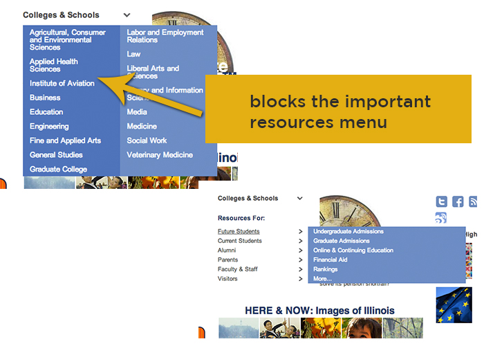
NAVIGATION BLOCKAGE
The Colleges and School menu list blocks the vital resources for respective audiences such as students, alumni, faculty, etc.. This necessary information is layered on top of the other navigations for the resources and could have been placed to expand on the right side instead. Disabling users to see this menu is a faulty design execution which could be fixed.
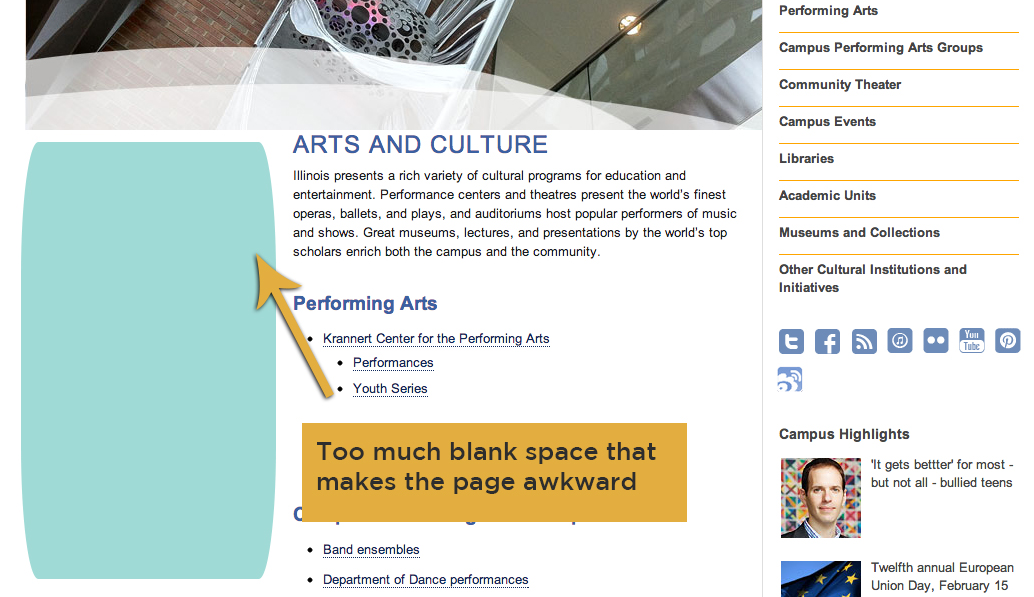
BARE WHITE SPACE
On the left side of the sub-pages, there is odd blank space that is reserved for extended menus only placed on some of the other pages. This unalignment and ineffectual usage of space makes the placement of text look off. By shifting the sub-menu on the right to the left side instead, users will be able to easily utilize the menu as users are used to reading from left to right. This not only make the space look clean and the page fittingly situated on the page, but it ensures that text is more refreshing to the eyes. The contrasting image headers do not compliment the pages as well since they lack aesthetic style.
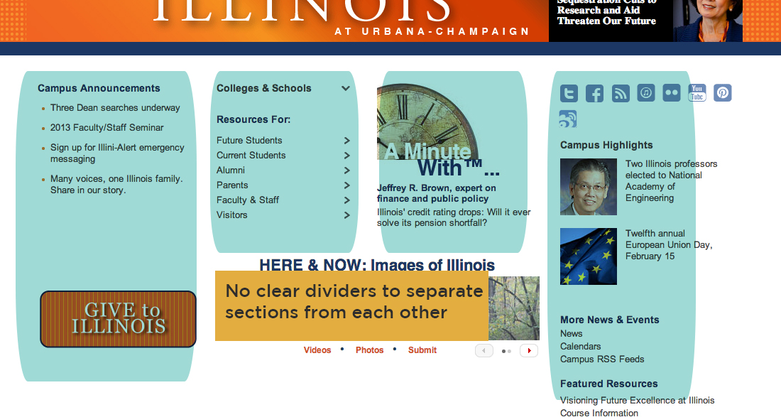
DISORGANIZED + LACK OF STRUCTURE
Although the website does use different tints of orange and blue to fill in letters and bold them, sections in the pages aren't as easily distinguishable due to the lack of clear separation. The website needs a touch of simplicity as it is quite overwhelming to look at. Clear section dividers would help improve the website to make it spick-and-span. The structure of the website can immensely be improved with good usage of space and insertion of nicely sized images would help add some pizazz to the site.
9. Help users recognize, diagnose, & recover from errors
"Error messages should be expressed in plain language (no codes), precisely indicate the problem, and constructively suggest a solution."
– Jakob Nielsen
When you hit a wall while maneuvering through a website, there should be ways to identify your problem and solutions to help you recover. Errors are hard to escape from in large-scale websites, but incorporating quick fixes will rescue a user from frustration.
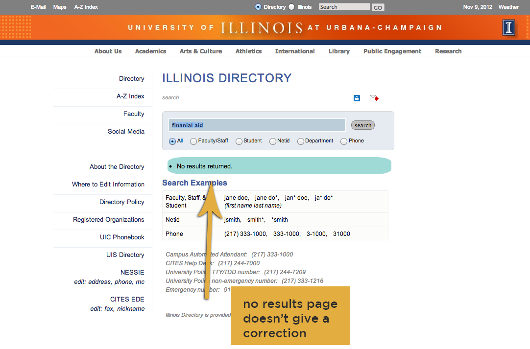
"no results" page
"No result" pages oftentimes put users in a frenzy as they are lost with where to go on from there. The University of Illinois website has several of these errors (one is pictured to the left). When a user misspells financial aid when using the directory search query, they are lead to a no results page. Suggestions on similar spellings may aid users, but the page only provides search examples for extra support.
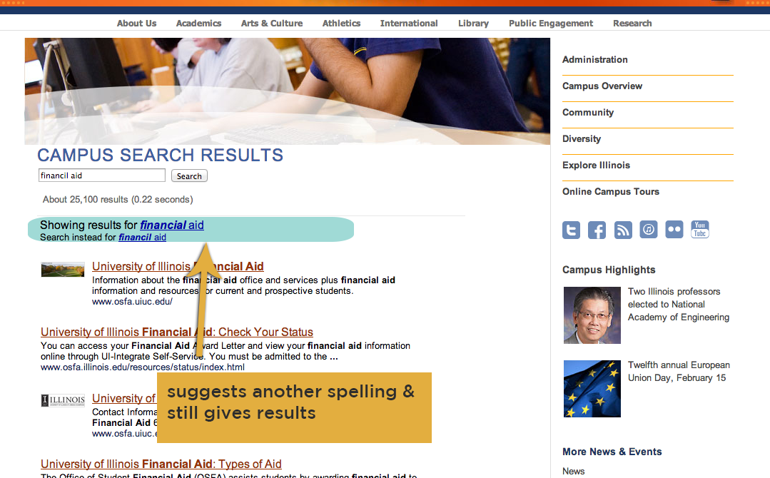
spelling correction
Although there is no auto-correct function for the website, spelling error corrections in some of the search queries throughout the website are provided. For example, when a user types in "financil aid," the engine generates results for the corrected spelling of financial aid instead. It offers a substituted result for the following misspelling.
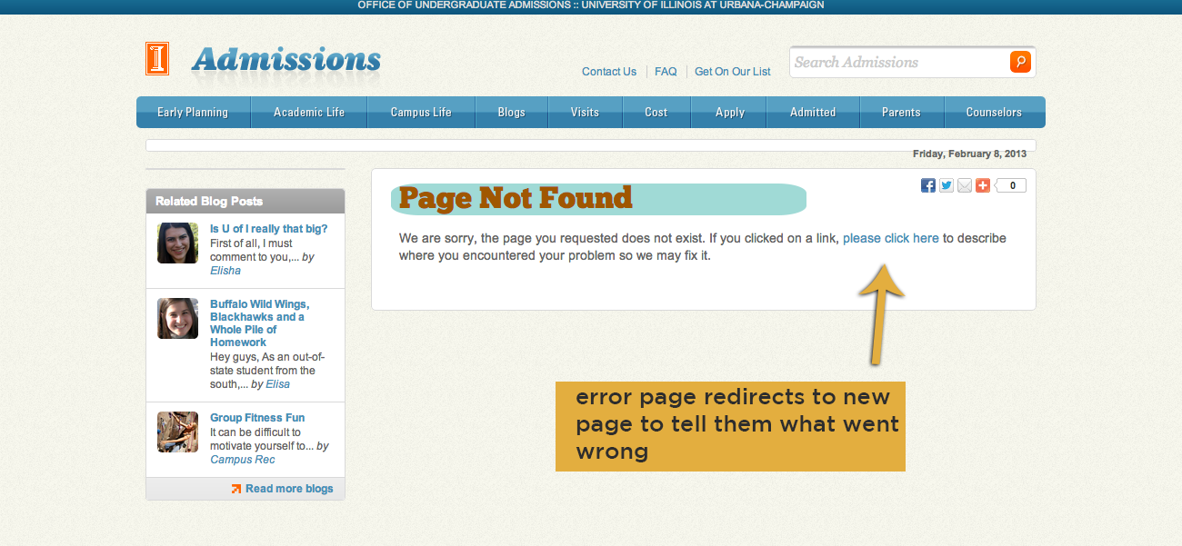
404 error *page not found*
The external link for "apply for admission online" under the contacts category leads to a 404 error page. In this case, the link automatically redirects to an error page that has no specifications on how to reach the working site. The page ceases to exist and asks the users to click another link to explain where the page error emerged from. This is inefficient as users don't exactly know why the site is not working in the first place.
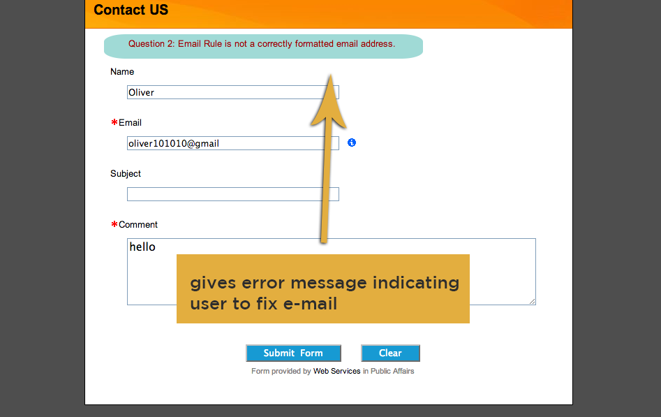
form submission
The external link for "apply for admission online" under the contacts category leads to a 404 error page. In this case, the link automatically redirects to an error page that has no specifications on how to reach the working site. The page ceases to exist and asks the users to click another link to explain where the page error emerged from. This is inefficient as users don't exactly know why the site is not working in the first place.
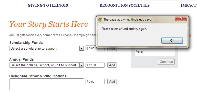
POP-UP
When filling out the form found under the "Giving to Illinois" page, there are good measures taken to ensure errors are prevented, or at the very least, brought to the users attention.
10. Help & Documentation
"Even though it is better if the system can be used without documentation, it may be necessary to provide help and documentation. Any such information should be easy to search, focused on the user's task, list concrete steps to be carried out, and not be too large."
– Jakob Nielsen
Despite of the superb quality of any website, help and documentation serves as an alternative SOS to answer curious or taxing questions. The University of Illinois definitely shines in this category compared to other University websites as it offers webpage specifics. Although this is a major plus, the website does not make this section obvious as it is hidden in the footer.
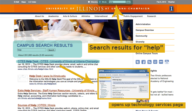
"HELP" Search Results
When "help" is inserted into the search bar, users are directed to a page providing resourceful links regarding to a variety of types of help. The results, however, do not provide a direct link to the website's own help page. For instance, by clicking on the first link "CITES," users are led to an entirely different website for technical service help.
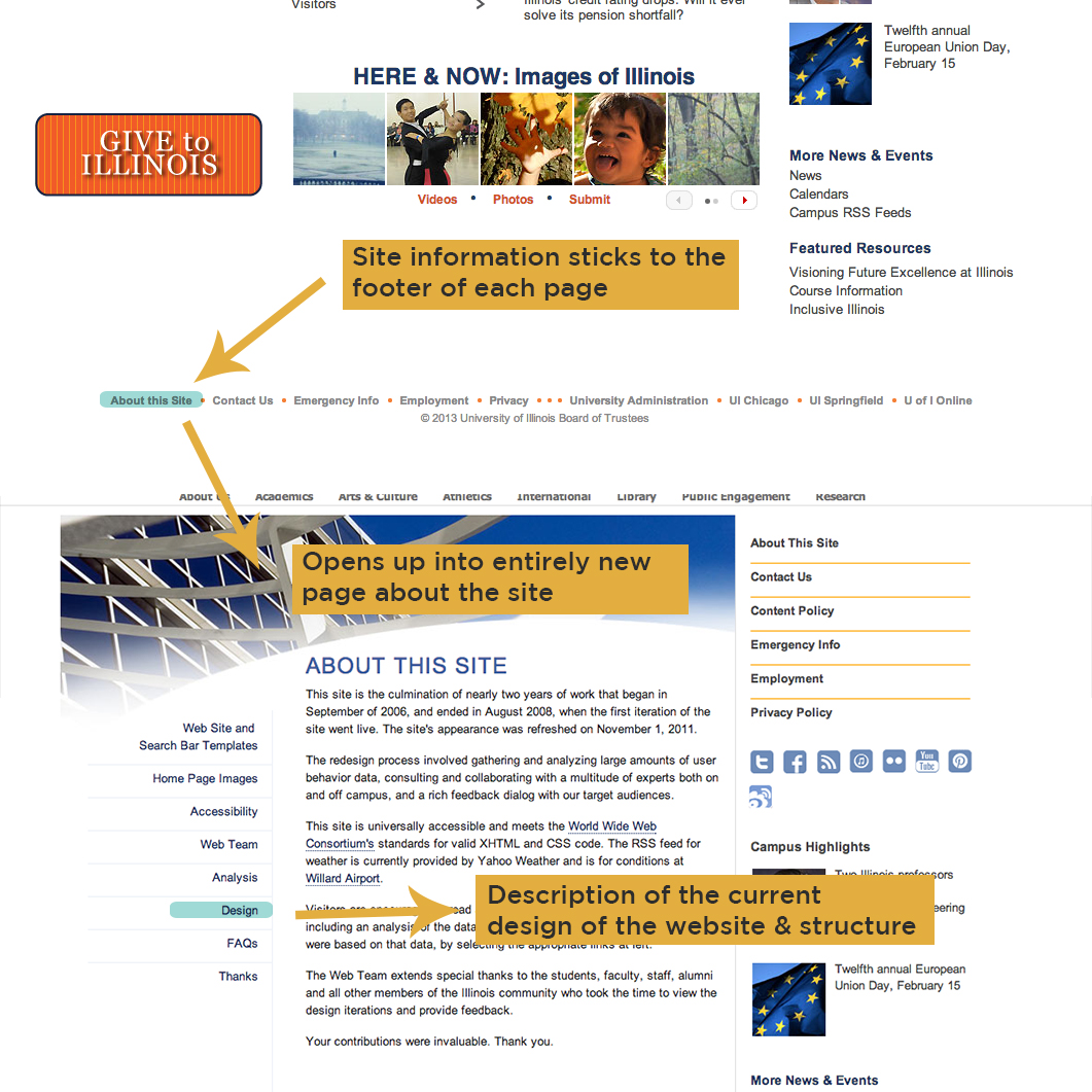
About This Site Page
Notably, the University of Illinois website provides an "about this site" section located on the footer. When opened, the user will be able to learn about the design team, design, features, and past looks. They offer an extensive menu bar on the left side to let you know just a little bit more of why the site was rebuilt and gives you a gist of the background of the website.
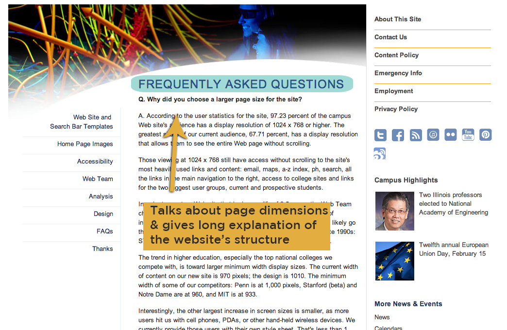
FAQ
On top of having an "about this site" page, the website includes a "Frequently Asked Questions" page to answer questions about more specific properties of the website.
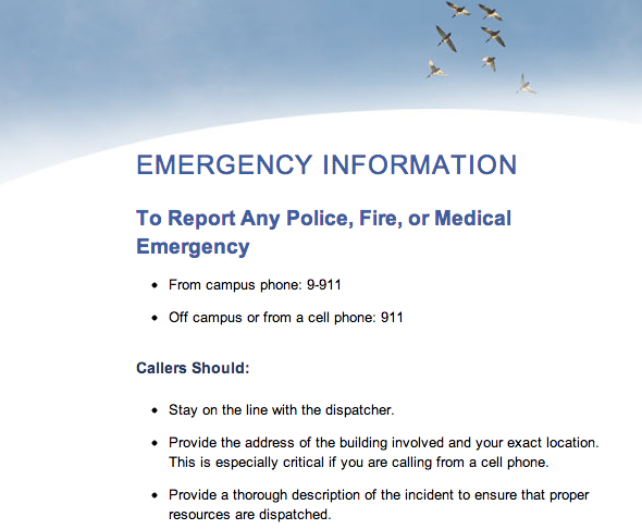
emergency info
When trouble comes your way outside of the internet, the university provides an emergency information section. Alerting designated personnel is easier as necessary contact information is listed on the page.
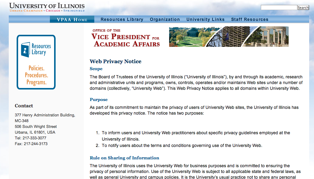
privacy
This section gives you an in-depth perspective on privacy issues regarding the website. Documentation of this information is oftentimes used by a different audience when legal problems come into play with the website.